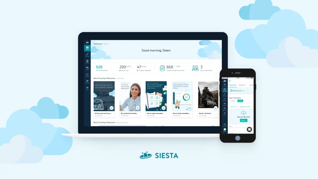

I joined Napp to improve the user experience of Siesta, a digital publishing platform. Two months in, the company decided to expand the product into Partner Relationship Management—broadening the scope tenfold.
Challenge
Barely two months after I started, the company decided to expand Siesta from a Publishing platform into a Partner Relationship Management (PRM) platform. Just like that, the scope of the redesign grew from improving an existing product to supporting a completely new direction and strategy.
The challenge wasn’t simply to add new functionality. It was to make a changing product still feel logical for both existing and future customers, as well as rewriting the communication around it and redesign the visual identity. Phew.
Discovery
Partner Relationship Management was a completely new domain to me, being early in my career. That meant starting with curiosity rather than assumptions.
I spent time listening in on sales demos, interviewing a few customers and talking to both Sales and Leadership about the new direction. Research was limited, but one thing quickly became clear: Customers rarely talked about uploading PDFs or organising files exclusively.
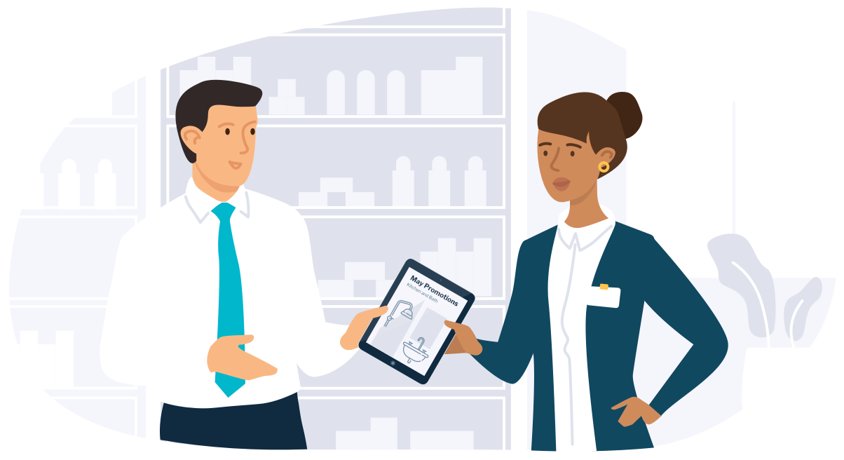
They talked about what they wanted to do with those files: making sure a reseller knew their new faucets could switch from serving boiling water to sparkling water in a matter of seconds. They wanted to be a close partner with resellers, so they could feel confident selling their products and brand.
Strategy
The redesign focused on translating the new product direction into something customers could easily understand and navigate on a daily basis.
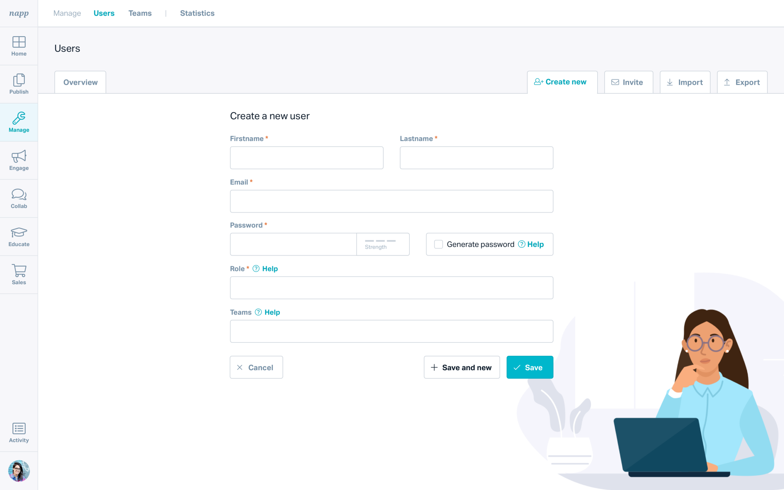
The information architecture was reorganised around activities instead of individual features–Publish, Engage, Manage, making the growing platform easier to navigate while being able to support many future features.
Terminology, copy and navigation was revised to better match the language customers actually used. One example was replacing technical concepts like Access Groups with a more familiar word—Teams—supported by information inside the feature and support articles.
The redesign extended beyond the product itself and included visual identity, website and SoMe channels, ensuring the company’s external communication reflected the same product direction.
Contribution
As the company’s sole designer, I translated the new product strategy into a coherent product experience using (and learning) skills outside of design.
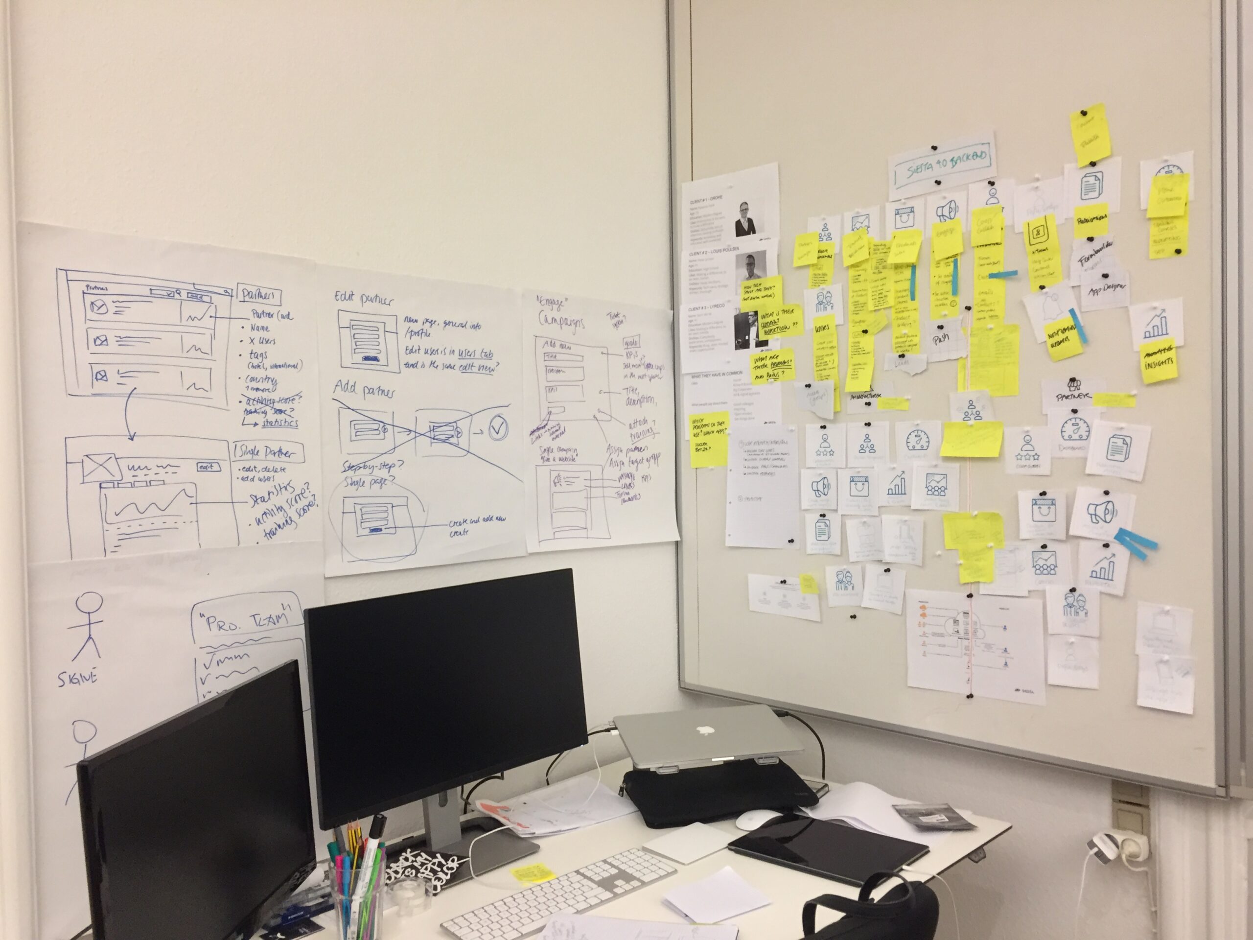
- Product discovery through customer interviews and sales demonstrations
- Information architecture, user journeys and navigation
- UX writing and product terminology and UI design across web and mobile
- Website design. content and the overall visual identity
- Illustrations, iconography and marketing assets
I worked closely with leadership as the product direction evolved and collaborated with developers to refine solutions as they were implemented.
Outcome
The redesign established a new information architecture, navigation model and visual language that supported Siesta’s transition into Partner Relationship Management, and which was ready for future development and new features.
Napp continued evolving afterwards, and was later repositioned again into a Sales Enablement platform before being acquired by Templafy in 2020.
Learnings
This project taught me that redesigning a product isn’t only about improving interfaces. Sometimes the first challenge is understanding an unfamiliar domain.
Looking back, it’s also a reminder to stay curious and open rather than becoming attached to the first solution. When the direction changes, good product work starts by understanding why, before deciding how, and that mindset has stayed with me ever since.