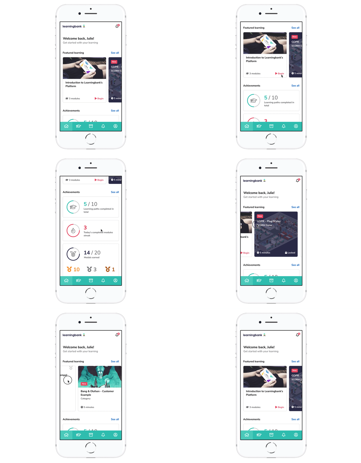
During my first week at Learningbank, I was asked to identify a handful of low-hanging UX improvements. Instead, I ended up making the case for bringing forward a full redesign and giving it a clear, strategic focus.
Challenge
My onboarding task as the new kid on the block at Learningbank, was to use my first week to identify “low-hanging fruit” UX improvements that could take the product quality up a notch—and present my findings to the leadership team.
But as I tested the platform, it became clear to me a few tweaks weren’t going to cut it. I also learned that a redesign of the platform was already part of the plans for later that year. Rather than spending three weeks polishing usability, I needed to convince leadership that sooner was better than later.
Discovery
I needed to know who I should be improving for before being able to say what should be improved and how. Problem was, data was scarce. So I worked with what I had: a survey to one of our biggest clients (29 responses — thin, but it matched our core audience) together with insights from colleagues.
As for the analytics they were clear: desktop was winning the traffic. But numbers alone don’t tell you why—data shows behaviour, not preference. If a platform doesn’t do well on mobile or tablet, you opt for a computer instead, if you have one nearby, otherwise, you just probably just don’t bother at all.
And while the dashboard seemed like the obvious (and sexiest) place to focus, it wasn’t where the real value was. My instinct told me the lessons themselves were, and more importantly—the experience taking them on mobile devices.
Strategy
My initial assumption was around 60% of our clients’ end users were up to ~30 years of age, and the majority of them prefer taking lessons on a mobile device.
If we apply the 80/20 principle and say end users spend 80% of their time in 20% of the system—taking lessons—and since more than half them are mobile, if we focus on optimising taking lessons on mobile, we could potentially improve 80% of the user experience for 60% of users. That felt like a good place to start.
Optimising the “learning flow” on mobile could potentially improve 80% of the user experience for 60% of users.
Redesign Goals
- Increase traffic from mobile devices. We had a 30/70 percentage desktop split which I suspected didn’t match the number of users who actually wanted to be mobile.
- Increase the number of lessons completed. With new initiatives to nudge users into courses, we should see a rise in the number of lessons completed.
- Solve the initial issues from the survey sent to our big client. We’d follow up on whether we solved it by sending out a new, similar one.
Also, the redesign was guided by three simple priorities:
- Improve the Mobile Experience.
- Improve the Learning Experience.
- Improve the Personal Experience.
Improve the Mobile Experience
Improve the Learning Experience
Improve the Personal Experience
Contribution
The redesign was already part of the plans. My contribution wasn’t inventing the idea—it was making the case for doing it sooner rather than later. A redesign can be a big mouthful, but I believe having clear priorities and a direction that resonated with the bigger vision for the platform, made it all the more digestible.
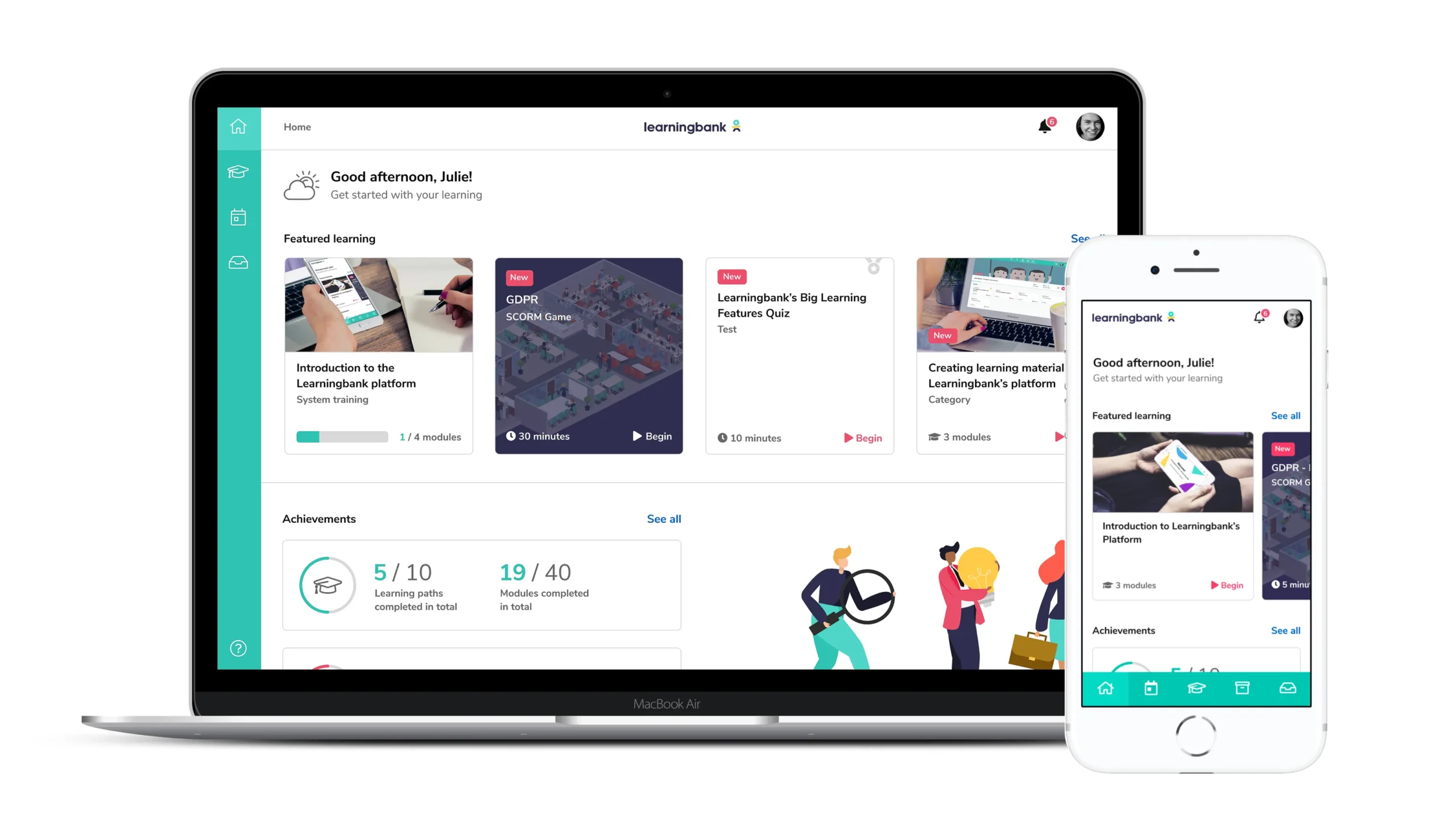
Apart from the redesign of the platform, i established Learningbank’s first Design System to support long-term consistency and scalability.
Outcome
The redesigned platform launched for end users in May 2019, though they had originally planned for design work to begin in Q2.
Following the launch, Learningbank recorded the highest number of completed lessons in the platform’s history at the time, and mobile traffic was on the rise.
A new, matching redesign for administrators was implemented shortly after in July, greatly improving the experience for the people building lessons. It wasn’t just a visual redesign, the codebase was also updated and modernised, becoming a much stronger foundation for the future.
Following the launch, we recorded the highest number of completed lessons in the platform’s history at the time
I continued working closely with the development team, and when later a colleague was promoted to Product Manager we established a strong collaboration and formulated the product vision of the future, together.
Now a Workforce Enablement Platform, this redesign from 2019 established the strategic and technical foundation on which the product rests today.
Learnings
Looking back, this project taught me to be bold.
It was my first time ever having to convince a room full of company leaders, but luckily, that room was filled with all the right people who were ready to listen and excited about change. When an opportunity already exists, sometimes the most valuable contribution is helping people recognise its potential and commit to it.